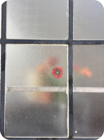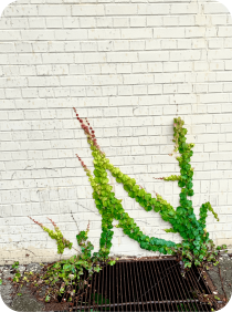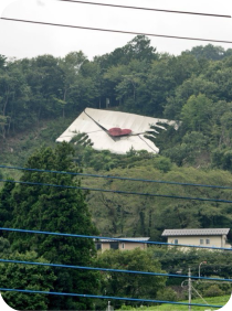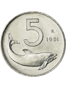
Saskia – You Left Your Soul Behind (2020)

box5ive – mushi (2025)

Emerald Web – Ars Nova (1982)

Finis Africae – El Secreto de las 12 (1984)

Dorothy Carter – Autumn Song (2023)

Dub Tractor – Hideout (2006)

Nala Sinephro – Space 1 (2021)

↜ back

A History of My Personal Website

2018 – foreverWeb design and development

Introduction

I’ve built my website from scratch since 2018. It’s a rich artifact of my self-teaching and self-construction over time. A significant amount of experience and thinking has gone into this site for almost a decade, and I created this timeline as an artifact of work and life that would be otherwise lost to the Wayback Machine.

Some themes extend through every iteration:

  1. I’ve always been drawn to lower-fidelity web aesthetics.
  2. It is an ongoing challenge for me to confine all my interests to a single narrative of "what I do," and I have grown less interested in resisting that over time.
  3. I like landing pages that are generous with information and I never opt for a pure "contact/about" page.
  4. I love a list.

If you're particularly fond of a version, click ✿ to appreciate it.

Version 1: 2018

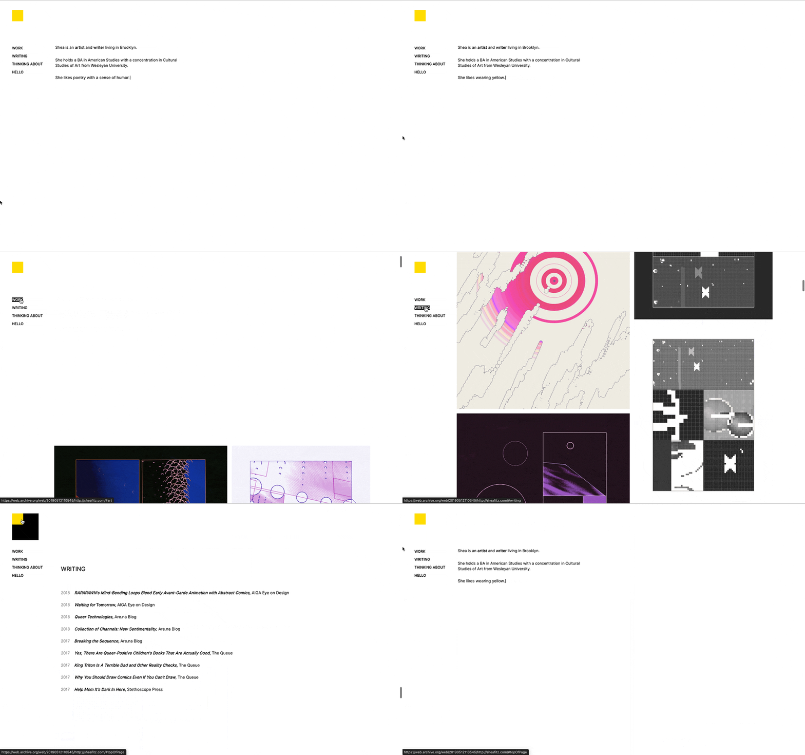
Animated 2018 homepage with a yellow square and a short bio about work, writing, and hello

In 2018, I had just graduated from Wesleyan University as an American Studies major with an invented concentration I dubbed “Cultural Studies of Art,” which basically meant I took an equal amount of American Studies and art classes. My transcript includes utopian societies, experimental music, new media art, IP law, public infrastructure, theories of friendship, avant-garde jazz, colonialist histories, oil painting, and other sincerely enriching topics that might render my degree incoherent to some. I had a work study job in the Marketing department at Wesleyan University Press as a student, so my obvious post-grad job prospects were in book publishing, writing, or conning my way into something I was unqualified for. In my senior spring semester, I took a “creative code” class that included an introduction to Processing, and I was flown to California for a final round of technical writing interviews at Google that I didn’t get (thankfully, I think), but all of this made tech seem, weirdly, viable.

I wound up getting hired as an Office Manager at a small NYC tech start-up where my friend worked. My responsibilities were booking meetings and ordering snacks from Amazon. It was slow and boring and everyone had strong feelings about the office snacks and I hated it. It made me existential in the annoying way that 22-year-olds get existential about having a normal job. Times have changed, I was so lucky then…but ultimately, gripes aside, I was at an office every day with software engineers who liked to goof off, and my friendships felt like a key resource should I choose to learn how to build a website, so I did.

During lunches and slow afternoons, I worked through the Harvard CS50 Computer Science course on EdX. I started inspecting personal websites I found on Are.na in the browser. I found one that had used the CSS library Tachyons and another that used Typed.js to animate the text in their bio. Most of the code I used in my own website was copied and pasted from other people’s websites or a library. The image galleries in this version of my website use copied and pasted CSS from this Tachyons page component. My coworker helped me with DNS pointing one afternoon and my hand-coded website was officially deployed.

At the time, I identified mostly as a digital artist who did some freelance writing. My illustration work was rooted in abstract comics and experimental 3D modeling, and I was interested in getting residencies and publication opportunities. I had no idea what jobs I would have in the future, but I had creative momentum here, and saw it as my long-term prospect. This version of my website tried to plant that seed.
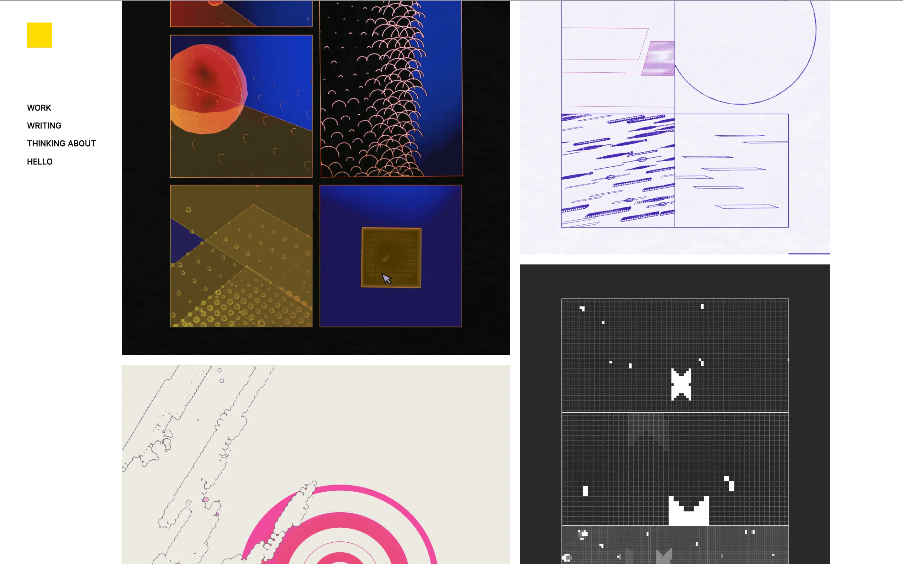
2018 work page, a poster grid of abstract drawings and pixel studies beside the yellow square

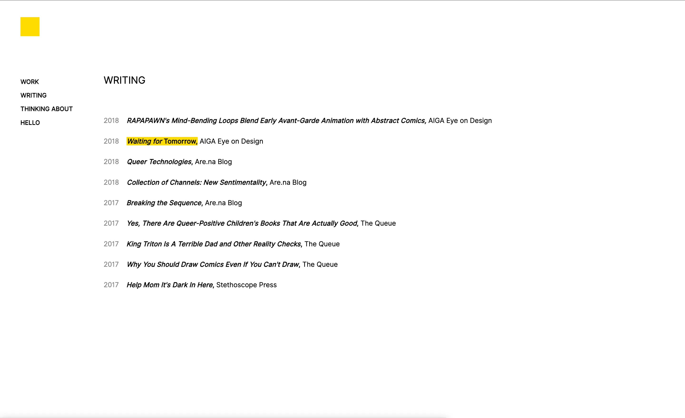
2018 writing page, a dated list of essays with one title highlighted yellow

Intentions

  • Keep the design simple but clearly custom
  • Highlight my visual art and writing without pigeon-holing myself in either

Milestones

  • Using media queries
  • Using Git in the terminal
  • Using a CSS library
  • Injecting a JS script into my HTML body
  • Hosted on GoDaddy

Favorite Feature

My “logo,” which was just a nested div with a hover state
Version 2: 2019

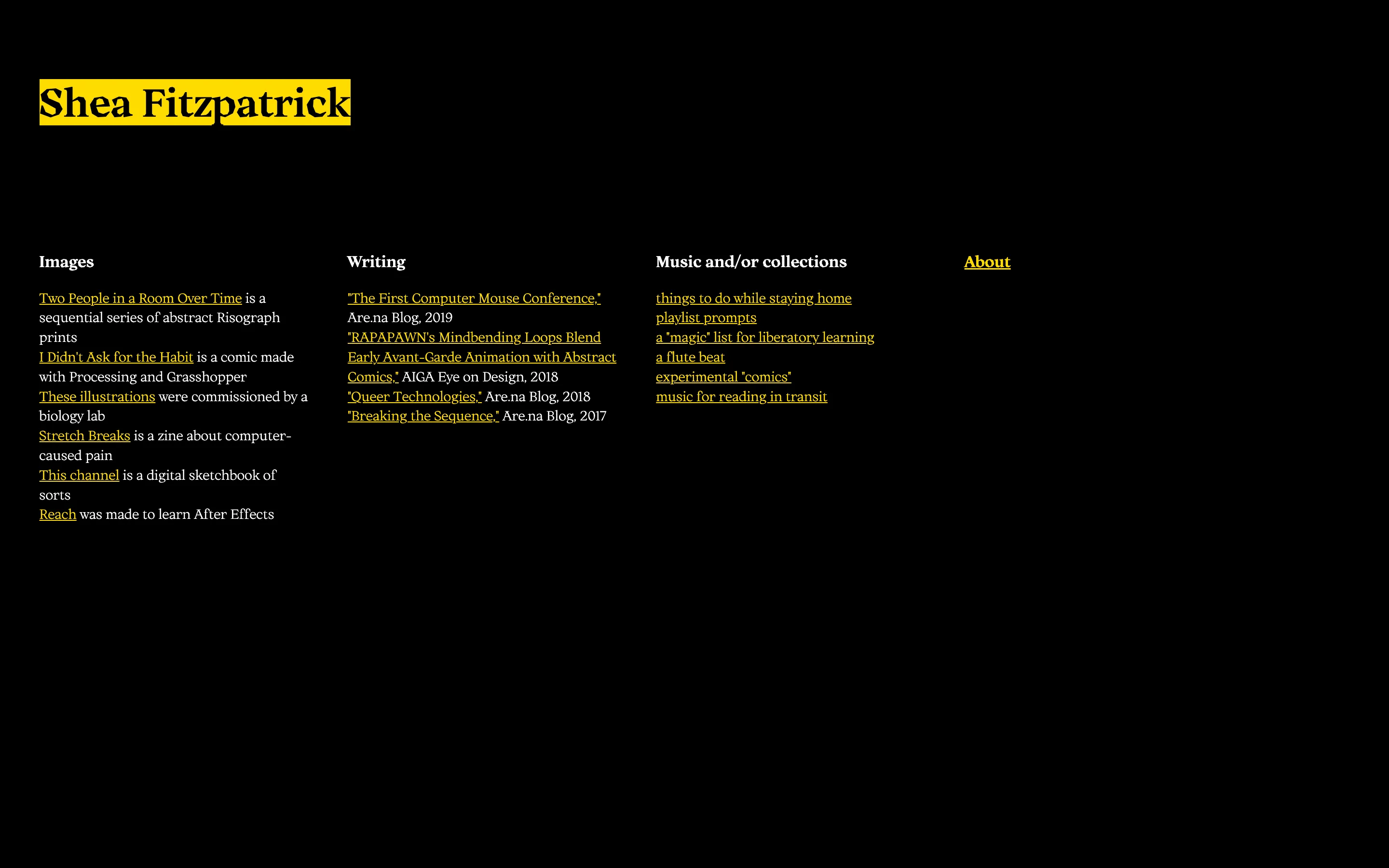
2019 homepage on black, yellow nameplate, and columns for images, writing, music, and about

At work, I jumped from a title of Office Manager to a title of “UI/UX Designer”, which is the kind of rogue maneuver you can get away with at a start-up by volunteering to do design system work at an entry-level administrator’s salary until you have enough project experience to make a genuine case for this kind of promotion (I later learned that a company calling a role “UI/UX Designer” is a design industry red flag, because it implies no one at the company understands either – but neither did I at the time).

At this point I still felt mostly like an artist, and was getting a lot of validation for my artwork, but it felt forced and, as I started having wrist problems, physically impossible. This iteration of my site still feels like an “artist’s website,” but I was losing bandwidth to focus on anything but finding a new job, so I would soon channel more energy to constructing myself as a web designer over an artist.

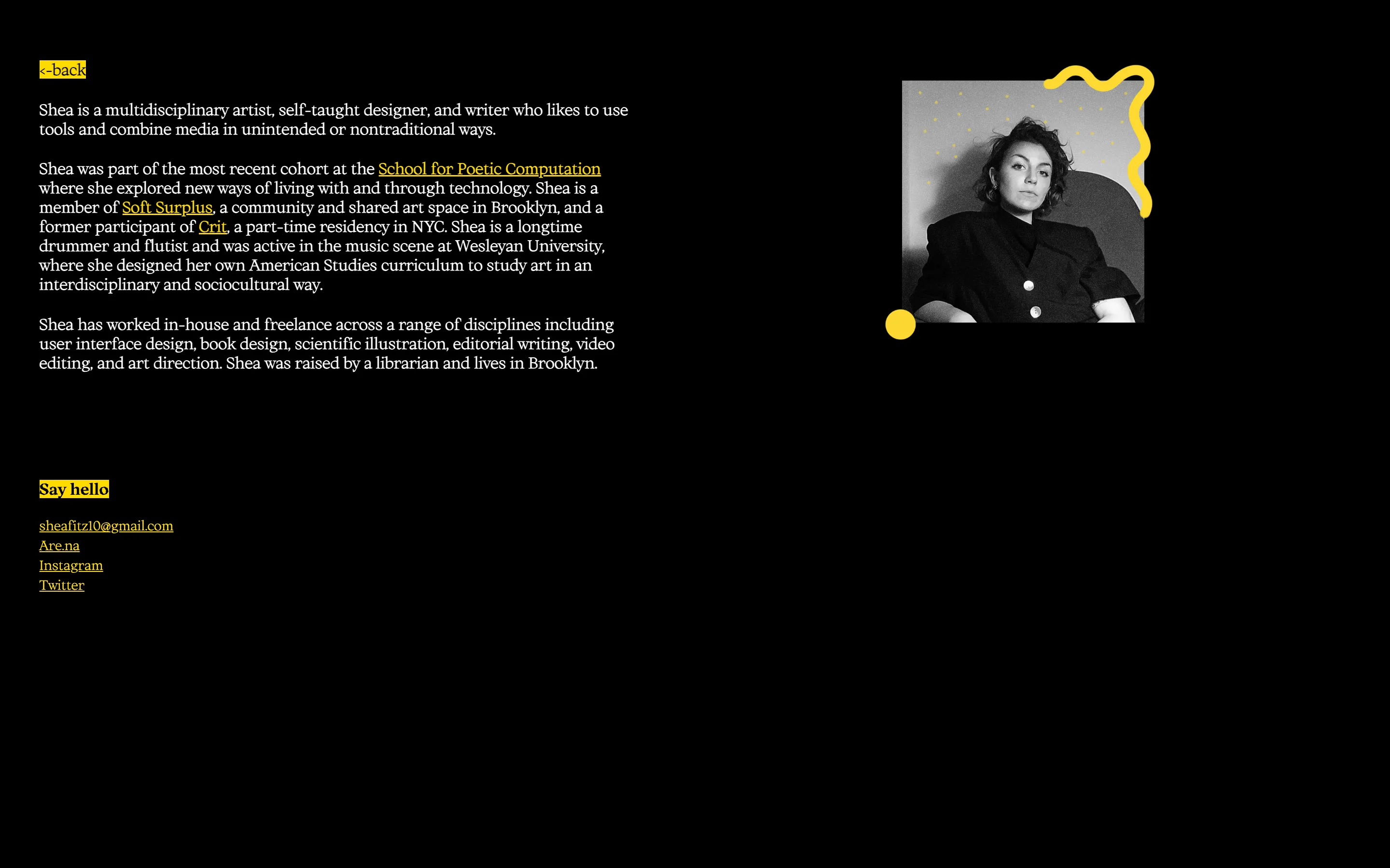
About page with a bio, yellow links, and a black-and-white portrait framed by a yellow squiggle

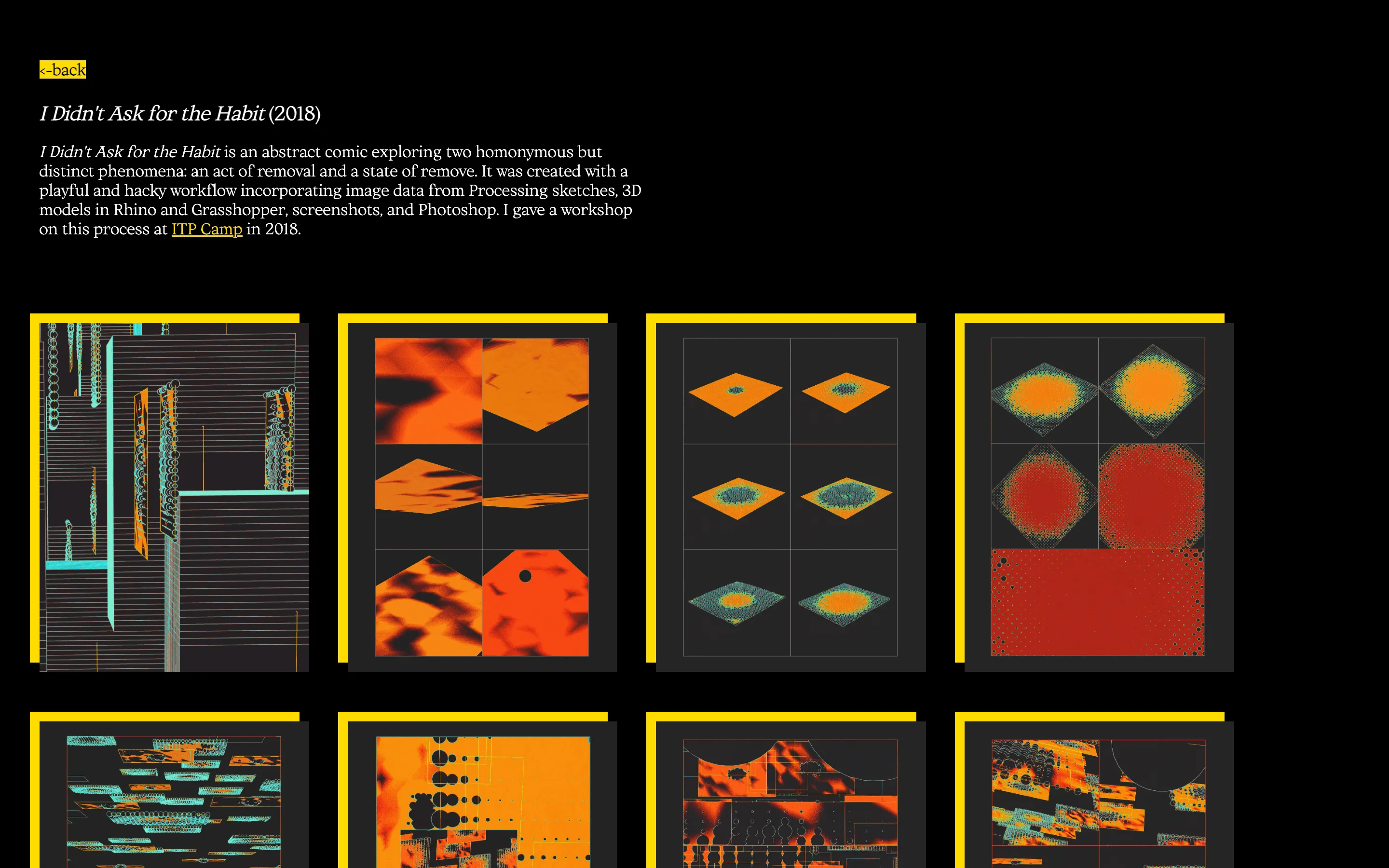
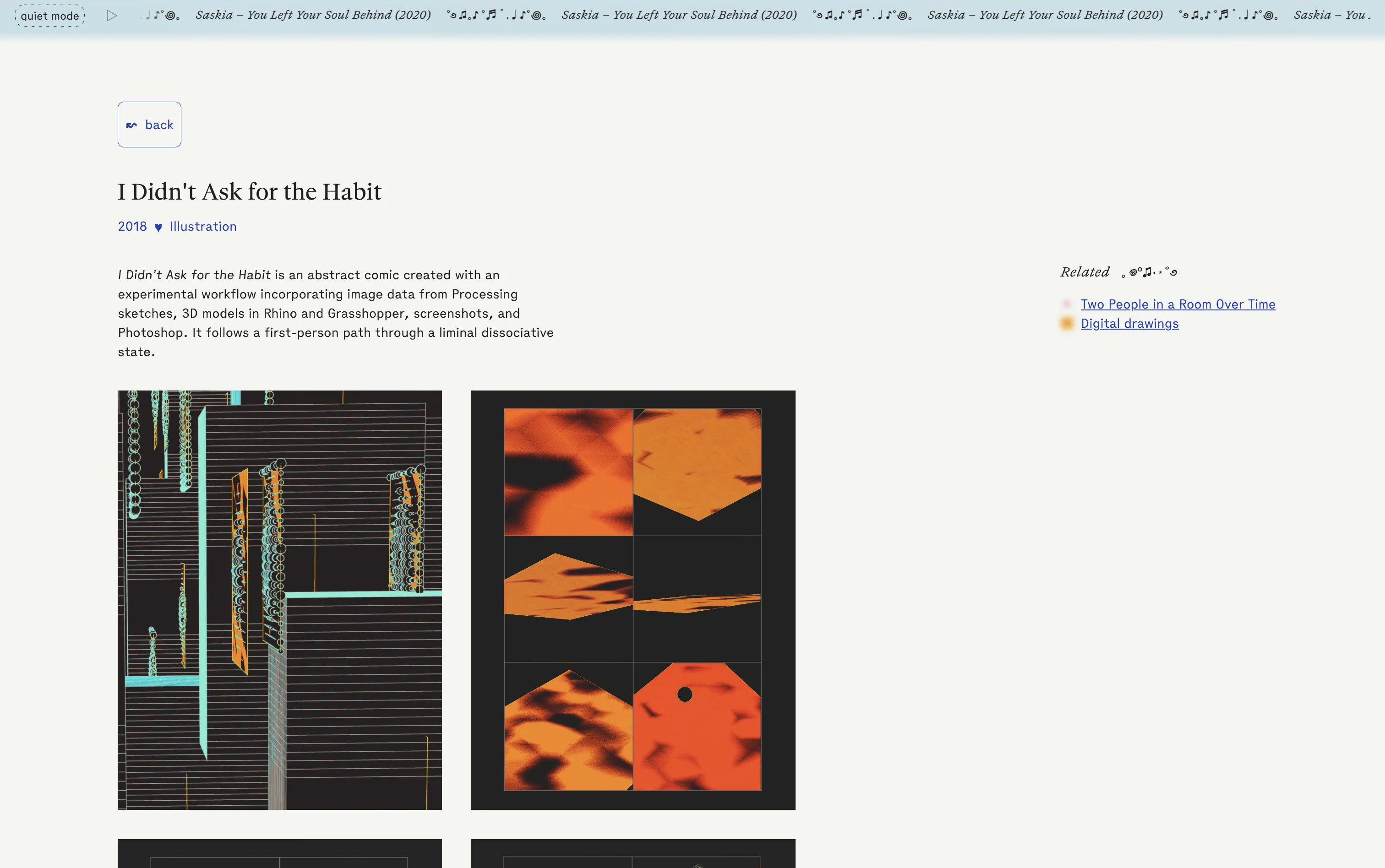
Project page for I Didn’t Ask for the Habit, with a grid of orange and teal abstract panels

Intentions

  • Create a denser display of information on the homepage
  • Give individual projects more room to breathe on their own pages
  • Iterate on a visual “brand” I had started developing using this color palette

Milestones

  • First multi-page website
  • More dynamic use of Tachyons page layouts

Favorite Feature

My doodle-y “headshot,” aka self-timer iPhone photo in a Berlin Airbnb

Version 3: Early 2020

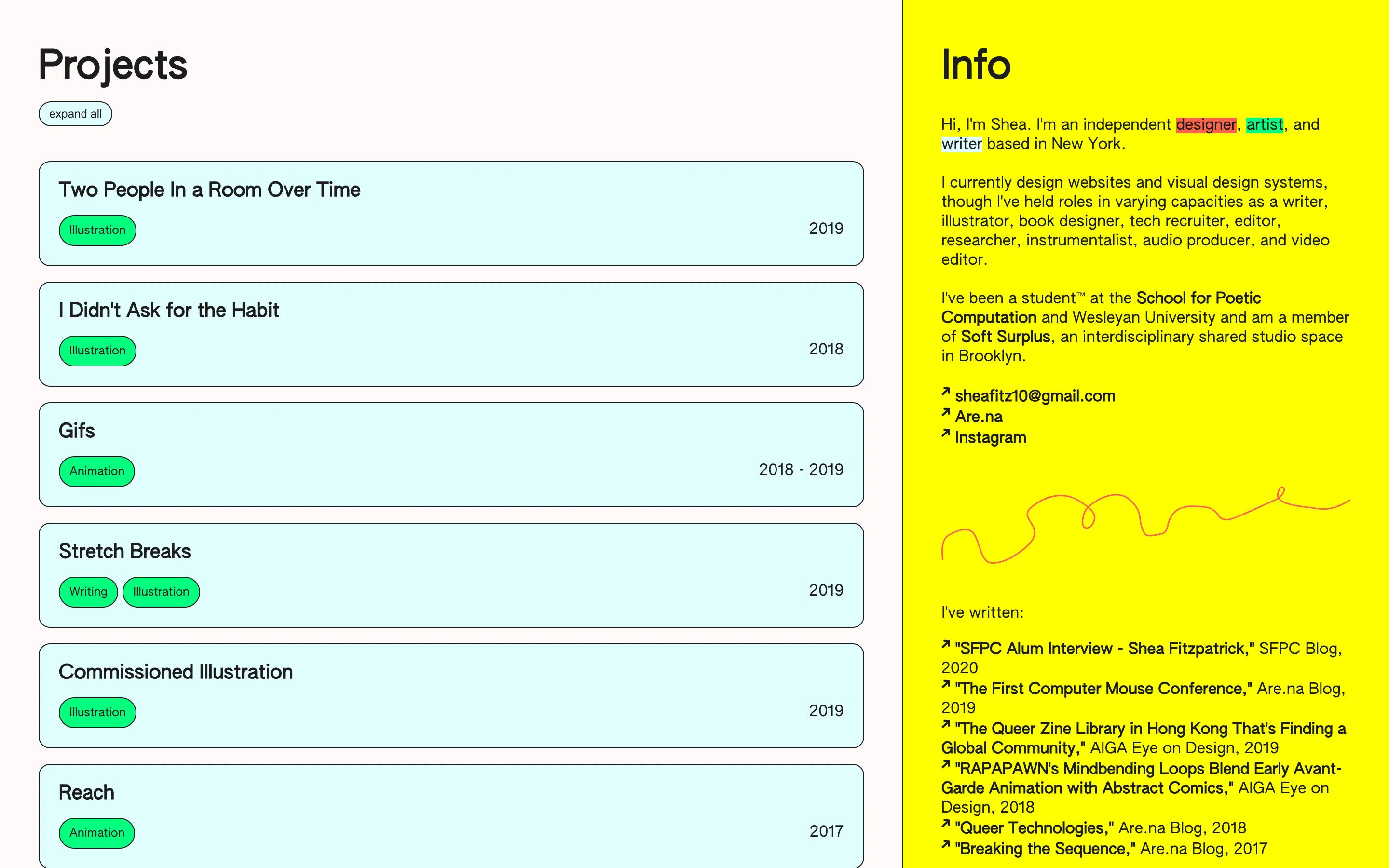
Split homepage with a pale project list on the left and a yellow info column on the right

I left that first job in March 2020 – I quit about two weeks before, unbeknownst to me, an impending lockdown and entered a 15-month-long freelancing stint and job hunt that required me to explicitly pivot my self-presentation away from art towards design. I didn’t have much design work to show for myself, so this iteration was my first attempt at treating my personal website as web design portfolio piece itself.

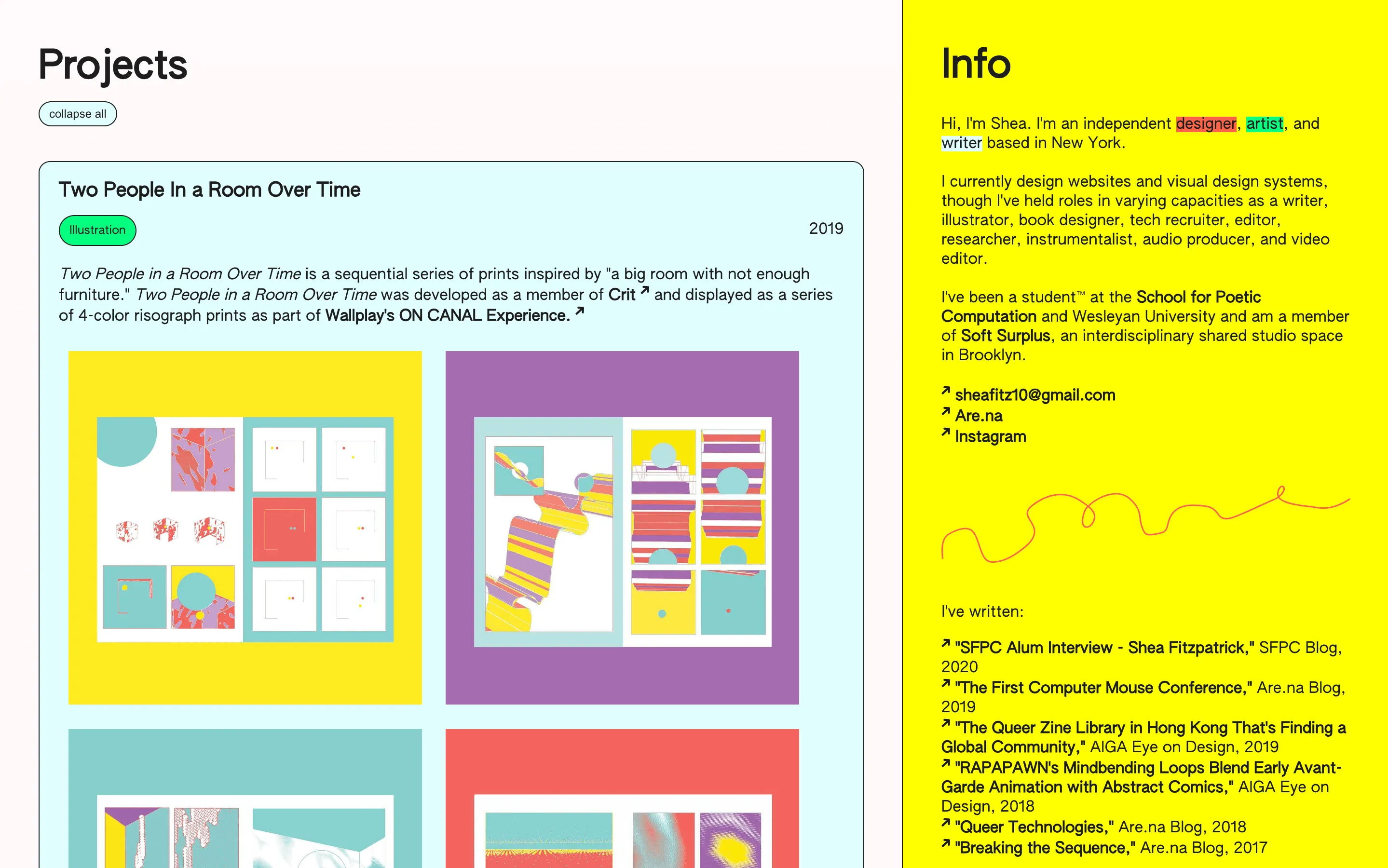
I was also beginning to feel self-conscious about a lack of cohesion in my visual work, and frankly didn’t like a lot of it. It was early quarantine, and I was working my way through the SuperHi JavaScript for Designers course, and I purposefully nested all images of my work so I wouldn’t have to necessarily design in conversation with them.

Expanded project card for Two People In a Room Over Time, with risograph prints beside the yellow info column

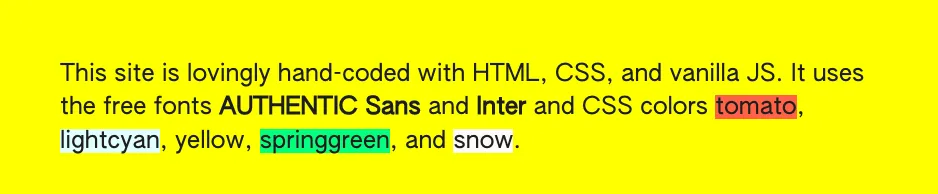
Yellow footnote naming the hand-coded stack and the CSS colors tomato, lightcyan, yellow, springgreen, and snow

Intentions

  • Infuse more personality into the design
  • Contain all info on one page with minimal scrolling
  • Create a more personal tone in my bio
  • Hide my visual work on the site’s first impression

Milestones

  • Writing JS from scratch
  • Building a split screen page layout with independent scroll behavior
  • Using default CSS colors

Favorite Feature

I used only default CSS colors in this entire design (tomato, snow, lightcyan, and springgreen), and cited them all like a footnote

Version 4: Mid 2020

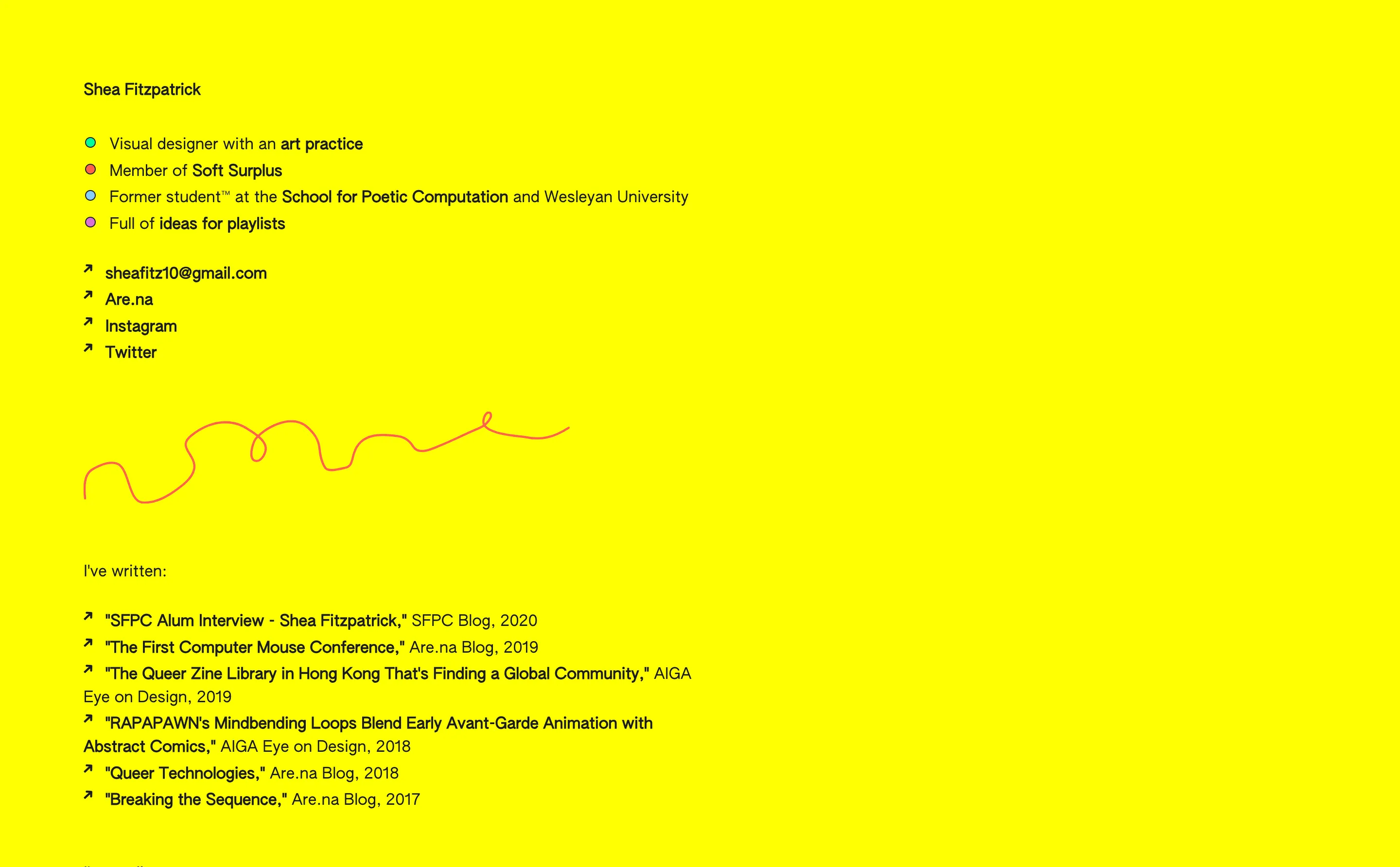
Yellow text-only page with multicolored bio bullets, contact links, a red squiggle, and a writing list

At this point, I was feeling increasingly detached from my identity as a visual artist, but felt like I had very little else to show for myself. I now had debilitating wrist pain that made it difficult to hold an object in my hands, let alone keep up a digital art practice while also doing computer-based work to support myself. I was indecisive and lacking confidence. A text-forward site was a shield for my inner angst.

Intentions

  • Deemphasize myself as a visual artist
  • Make myself seem as interesting and competent as possible without referencing actual projects or work experience...

Milestones

  • None
  • But my older sister ripped the source code for her own website without telling me which gave my inner child intense satisfaction

Favorite Feature

The custom multi-colored bullet points in the bio

Version 5: Late 2020

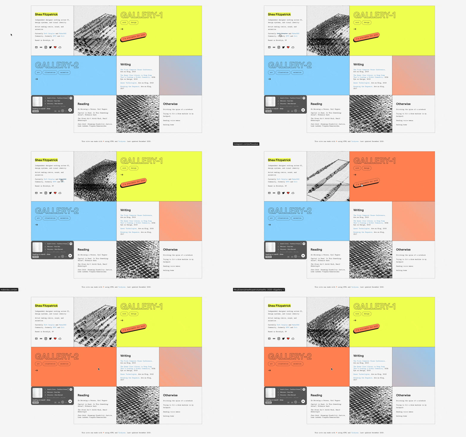
Animated panel homepage, a dollhouse grid of bio, galleries, writing, reading, and a music player

I had accumulated more freelance work as a web designer, but my design instincts continued to be informed by my interest in sequential art and abstract comics. I wanted to create a panel-based layout that housed a range of content that varied in form and utility, kind of like a website dollhouse. I remember being very inspired by Nathan Taylor’s portfolio, which I found on Are.na, but was unable to match, and slightly uninterested in matching, the fidelity of Nathan’s site.

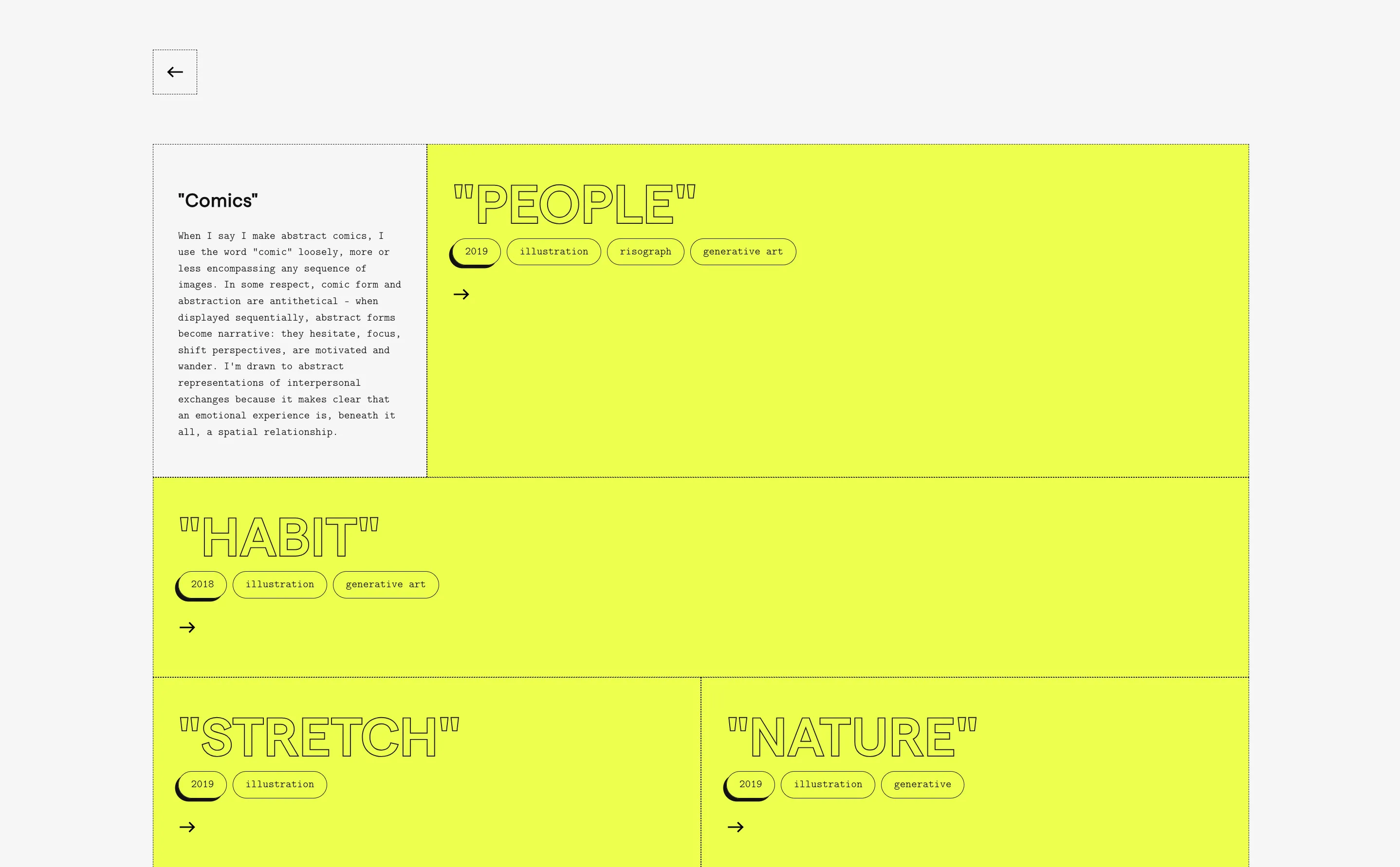
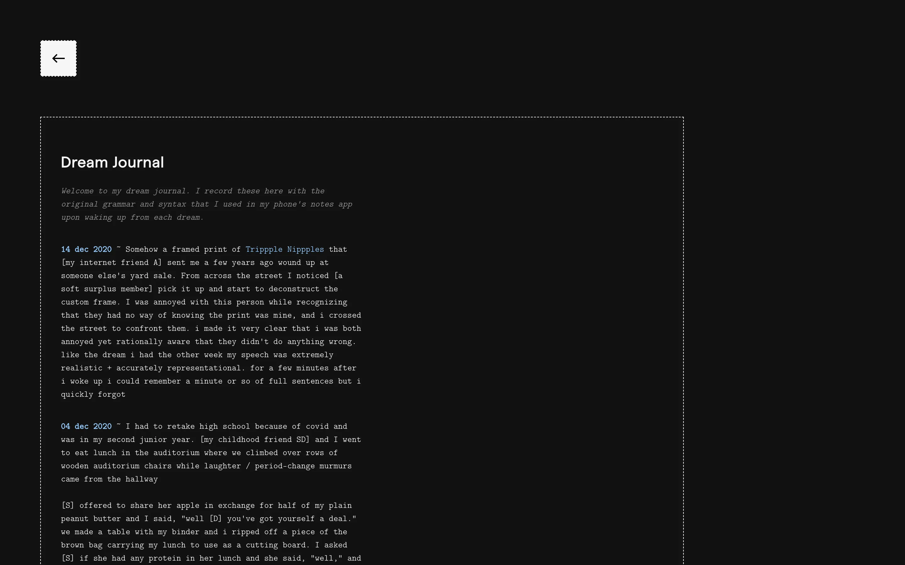
Yellow illustration gallery with outlined titles for People, Habit, Stretch, and Nature Hidden dream journal page on a black background, dated entries in lowercase

Intentions

  • Coherently distinguish between my design practice and art practice in a single portfolio
  • Make my website feel like a funhouse

Milestones

More advanced FlexBox layouts but still using Tachyons

Favorite Feature

I hid a dream journal as an easter egg on this site

Version 6: 2021

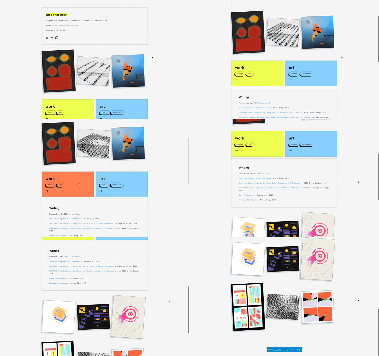
Animated 2021 homepage with a bio card, three tilted artworks, and yellow and blue work and art panels

My job hunt was becoming desperate, and I recognized a need to make my website more straightforward without losing its personality. I reverted to a more conventional layout and brought visual work to the forefront, but kept the same general styling and type treatment as the previous version.

This is my favorite iteration of my website before version 10 in 2024…it felt true to me and less like I was trying to recreate things I saw. It definitely didn’t look like a conventional design portfolio, and I took a lot of pride in that. I started to notice people adding my website to design moodboards on Are.na, and even found someone who ripped my style sheet and credited me on their own website. It’s the small victories…

This was my website when I got my first full-time product design job.

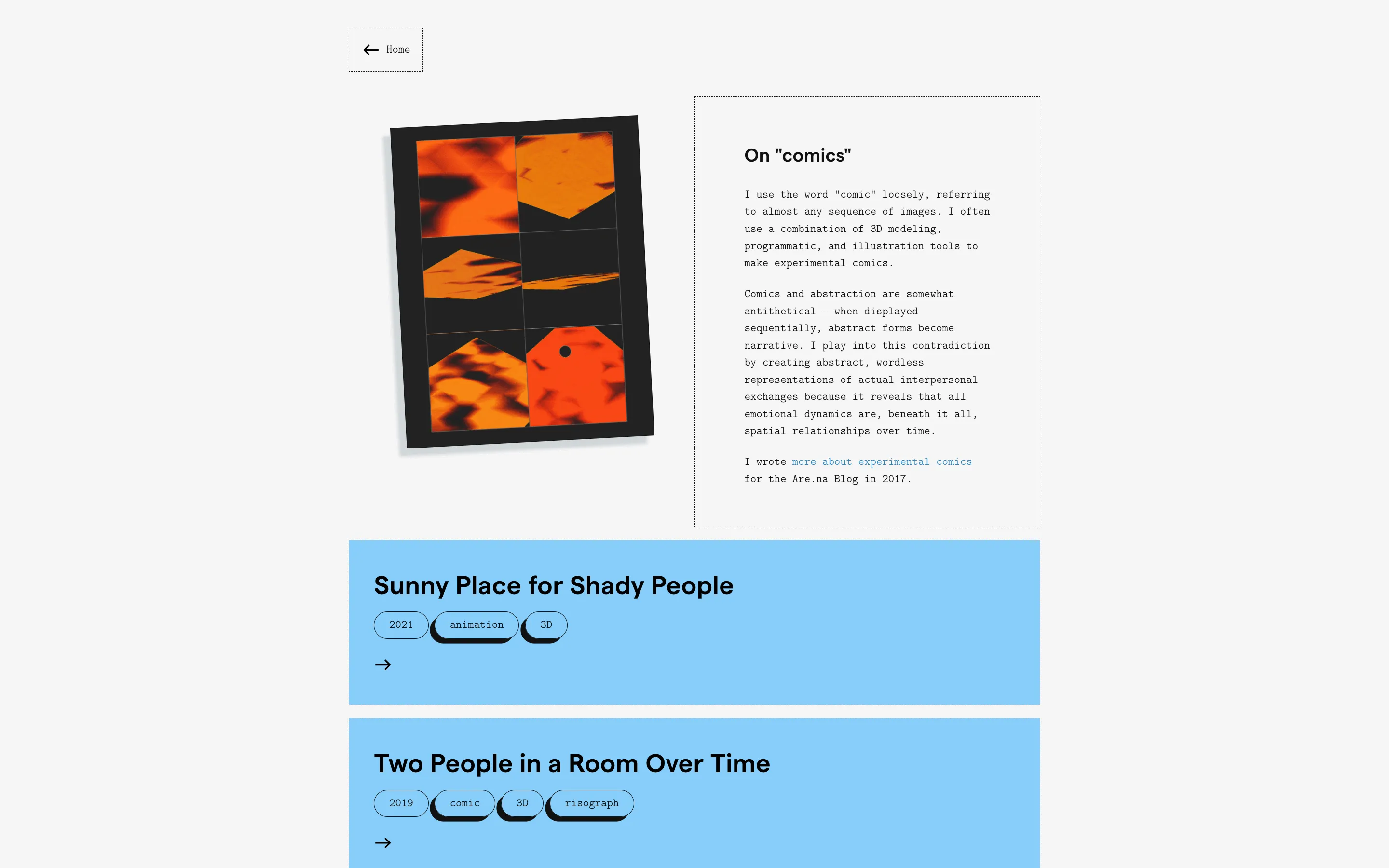
Art page with an essay on comics beside orange panels, and project cards for Sunny Place and Two People

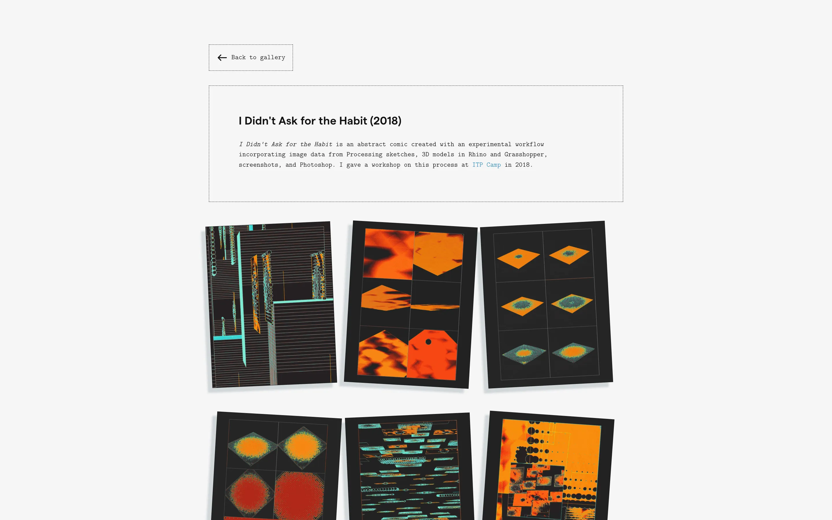
Gallery page for I Didn’t Ask for the Habit, six abstract prints on a pale background

Intentions

Find a job once and for all!!

Milestones

First time feeling like my website came from me and not from an assemblage of other people's designs

Favorite Feature

I loved this type treatment specifically because it wasn't necessarily "on trend"

Version 7: Late 2021

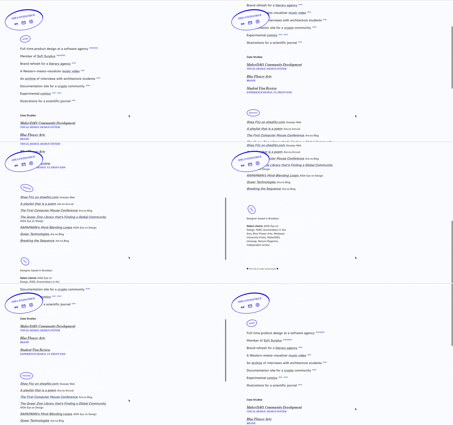
Animated sparse resume page with a hand-drawn name oval and a list of work and writing

I was in limbo here. Amazingly, I had a job now, but it wasn’t quite right for me and I was antsy about it. I wasn’t making art, so my old site felt disingenuous. I wanted to show that I was “doing stuff,” but had no way to unify what I was doing. I was honestly embarrassed of my work – this was so harsh on myself, because at the time I had maybe a year of actual design experience, and it was peak-pandemic – so I felt the need to reference projects without actually showing them, all framed around being “multi-disciplinary” (another shield). I wanted to hide myself…and I also wanted an excuse to learn React.

Intentions

  • Learn React
  • Create a minimal resume-like feel
  • Take my work “off the grid” for a bit

Milestones

  • Using React.js
  • Moved hosting to Netlify (WAY cheaper!)

Favorite Feature

The rotating headers on scroll (which I made with a library)

Version 8: 2022

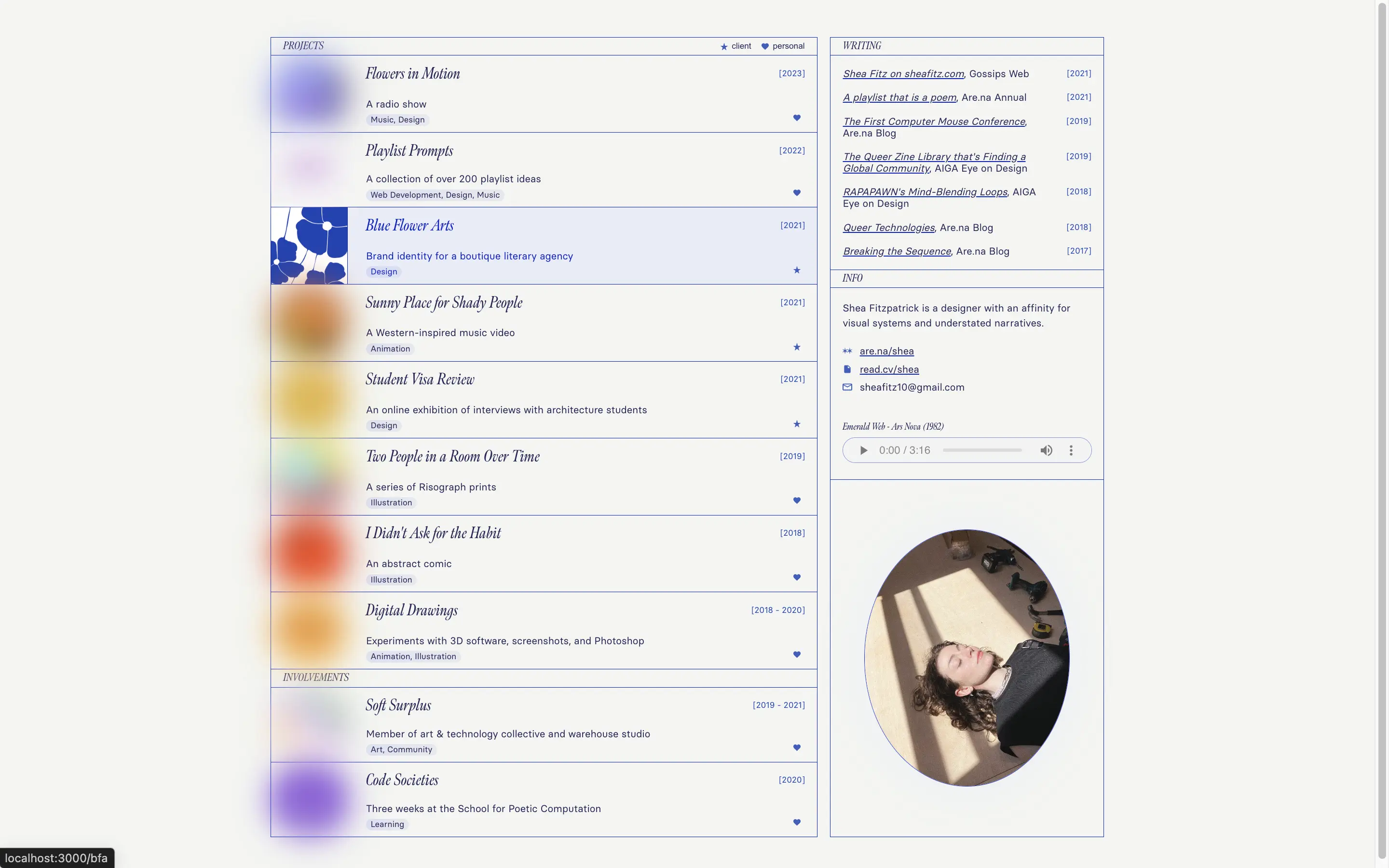
2022 homepage with a project index, writing list, an audio player, and an oval portrait

After 2 years as a product designer at an agency, I was back on the job hunt with a rigor. Rather than teetering between feeling like an artist vs. a web designer, my design sensibility grew more informed by artists whose medium is websites, namely Laurel Schwulst, Elliot Cost and the people I met through Elliot’s small social networks Special Fish and the now-defunct Gossip’s Cafe, like Rosemary and Mad.

I had a much better understanding of CSS thanks to Josh Comeau’s CSS for JavaScript Developers and was actually more comfortable writing all my CSS from scratch than using a library.

This was my website when I got a senior web design job at the New York Times.

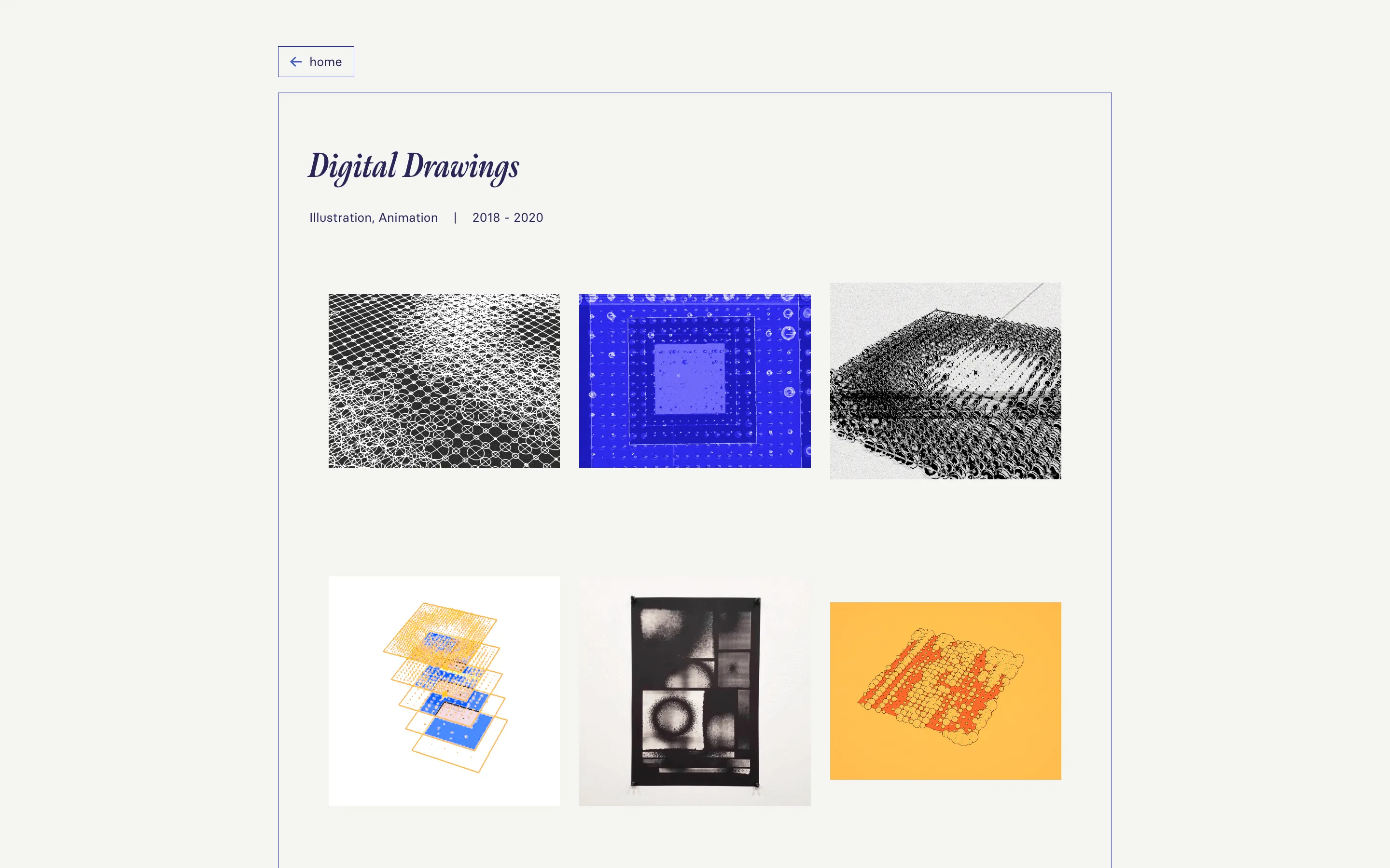
Digital Drawings project page with six abstract studies in a thin blue frame

Intentions

  • Evolve my design style from graphic and playful to thoughtful and atmospheric
  • Leverage a better understanding of React for more dynamic rendering and data handling

Milestones

  • Calling a third-party API
  • Using conditional rendering
  • Writing all CSS from scratch
  • having a website "theme song"

Favorite Feature

Giving the website a theme song (Ars Nova by Emerald Web)

Version 9: 2023

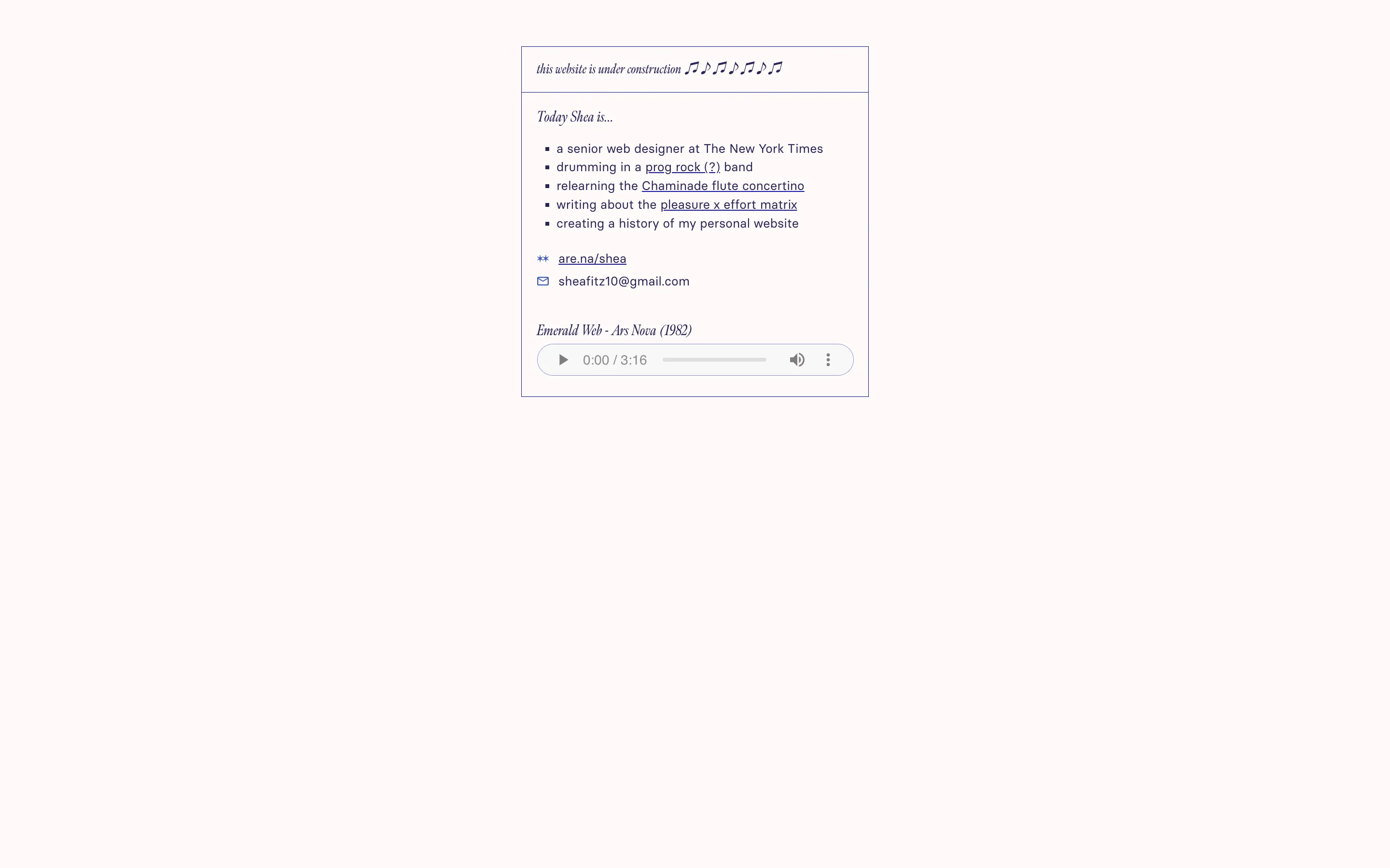
Small under-construction card on a pale page, with a Today Shea list, links, and a music player

This was a true placeholder site. I’ve had more of these over the years, but I haven’t kept track of all of them. I felt a new relief in being able to take myself off the internet after getting a job that felt like a career milestone.

My bio on this site opens with “Today Shea…” – I’ve had the domain shea.today for a long time (my name rhymes with “today”), and I always consider switching my domain from sheafitz.com, but there’s something that pulls me toward keeping the domain I’ve always had. It almost feels like trying to rename a stuffed animal from your childhood or something. shea.today will have its own place eventually.

Intentions

The “Gone Fishing” of websites

Milestones

I didn't need a job...and my website didn’t have to be anything at all

Favorite Feature

Music note header that I couldn’t center for the life of me (but I didn’t have to care)

Version 10: 2024

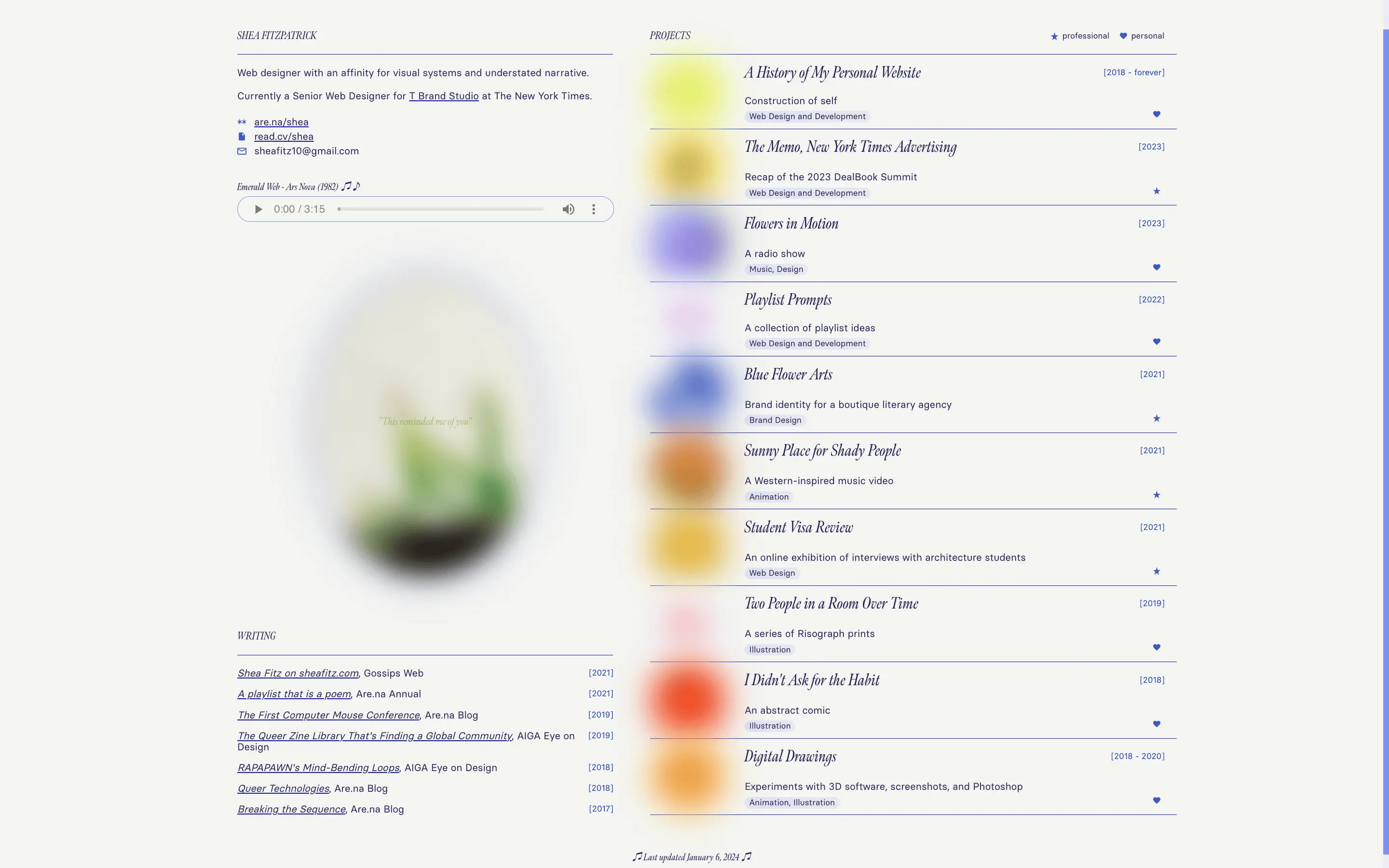
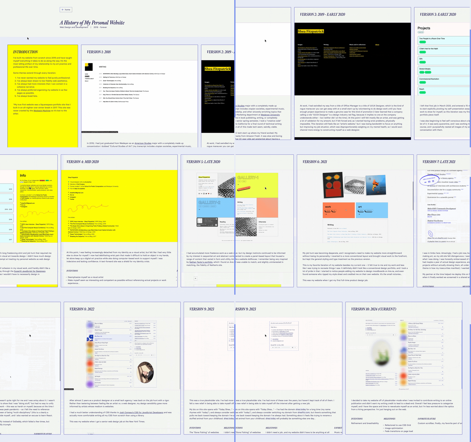
2024 homepage with a bio and music player on the left and a project index with blurred covers on the right

I decided to take my website off of placeholder-mode when I was invited to contribute writing to Syllabus Project and didn’t want my writing credit to lead to a dead end. I felt less pressure to categorize myself, and had some space and time to reevaluate myself as an artist. At the time I was less worried about the optics of my site from a hiring perspective, but my philosophy has evolved since then in that I now understand that my site inevitably and perpetually makes a statement from a hiring perspective. This was also the first iteration of my site that included this history of my personal website.

This site got more love online than any of my previous versions. This version, including this history of my personal website, has been added to Are.na by at least 70 people and connected over 150 times. I’ve met multiple people IRL that realized they already knew me from this website. Kind of wild…

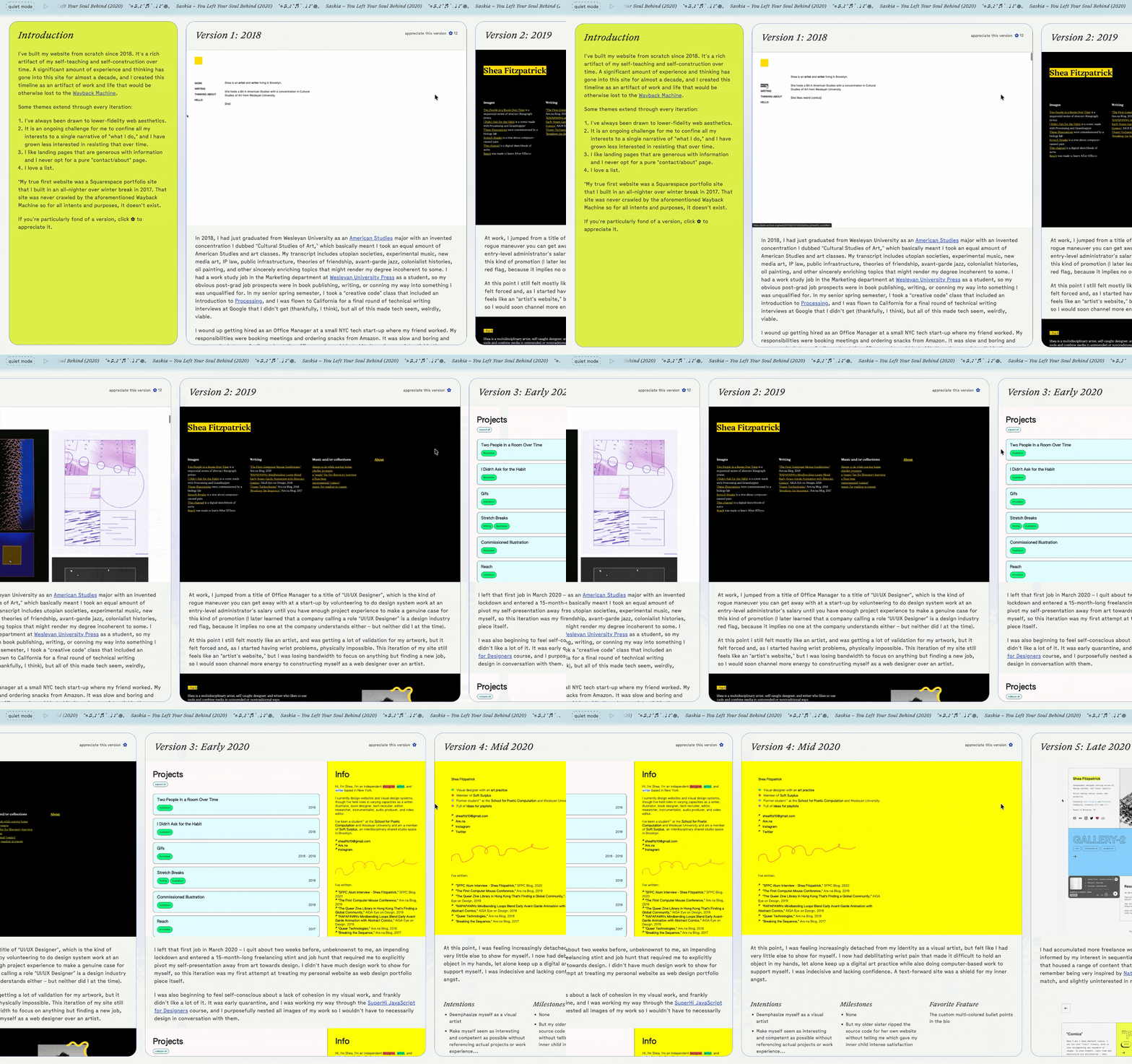
2024 history of my personal website in a horizontal scrollable timeline

Intentions

Refinement and breathability

Milestones

  • Refactored to use CSS Grid
  • Image optimization
  • Fade transitions on page load

Favorite Feature

Custom scrollbar, finally...my favorite part of any website

Version 11: 2026 (current)

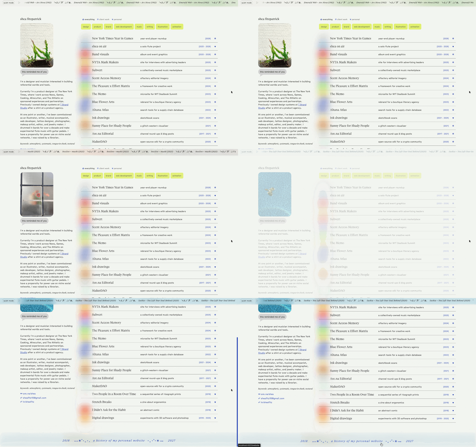
2026 homepage with a theme photo and bio on the left and a filterable project index on the right

Two years is an uncharacteristically long time for me to go without a website redesign, and v10 held up for a while. But over time I found the layout difficult to scale, and having an entire section dedicated to writing and features no longer served me. I also don’t love my type choices on the previous version (my old boss even admitted to me that he loved my site “except the fonts,” so maybe that got in my head).

I toyed with whether to rework v10 or completely overhaul it, and ultimately gravitated towards existing artifacts of my website (the atmospheric list, the “theme song”, the “this reminded me of you”) and wanted to elevate what I already loved instead of totally starting over for the sake of it. I also find this kind of iteration satisfying, because it makes the evolution of my design eye more stark when I reuse the same elements over time – you can see a big jump in sophistication between Version 8 and Version 10, for example, which was just a minor rework of the same layout.

I’ve also begun negotiating the “extended universe” of my online presence between this website (sheafitz.com) and my music website (sheaon.earth). I want to keep this site cohesive with sheaon.earth without just copying sheaon.earth, an impulse I definitely had to curb…

2026 project page for I Didn’t Ask for the Habit, with abstract comic panels and related links

2026 history of my personal website in a horizontal scrollable timeline

Intentions

  • Typographic refinement
  • More consistent and concise project content
  • Greater professional legibility

Milestones

  • Refactored from React to Astro
  • Assisted with Cursor
  • Filterable list

Favorite Feature

Persistent audio player, "appreciate this version"