home
homeBlue Flower Arts
Client
Blue Flower Arts (BFA) is a boutique, woman-owned literary agency known for their highly regarded roster of artists, historical legacy, and small business charm.
Ask
BFA wanted their brand to mark a new beginning: one that mirrored a change in leadership, the diversity of their roster, and the vibrant spirit of their team. Their goal was to relaunch their website with a complete rebrand in Summer 2021.
Timeline
2 monthsTools
Figma, Illustrator, PhotoshopResearch
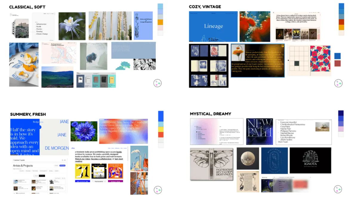
BFA's Project Manager provided us with initial brand research conducted with the in-house team - evocative questions like, "If BFA was a physical space, what would it be?" (A vintage brownstone, they said, or a cozy old victorian house). From there, we provided four visual themes to choose from, mix, and match.
Logo
When brainstorming for BFA's new logo, we gathered visual inspiration and established ways of describing BFA that could serve as prompts for our sketching and a source of truth for what the logo should communicate.
- BFA is like a stem supporting many flowers
- BFA is a unified collection of many artists
- BFA is an epicenter, artists are like petals
- BFA supports unique careers that can grow in different ways
Formal considerations that stemmed from these descriptions were:
- Should the logo have one or many flowers?
- If many, should they vary in size or shape? Or be a unified system?
- BFA is an epicenter, artists are like petals
- Should the logo reference a real blue flower?

Result
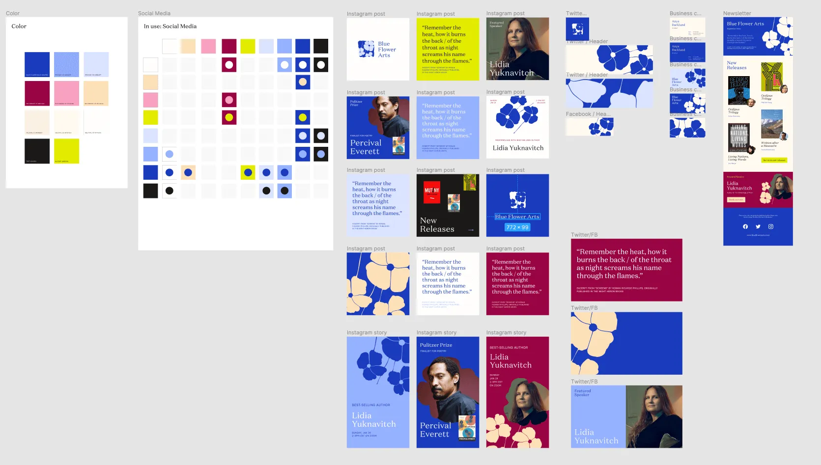
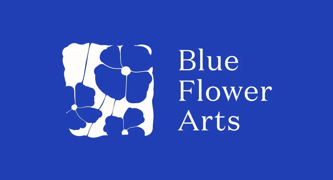
Drawing from Art Nouveau, stamps and seals, and blue poppies, we arrived at a logo that strikes the balance of strength, levity, tradition, and personal touch that BFA wanted their brand to embody. With the logo, we arrived at Blue Flower Blue - fresh and bright, but not corporate - and built out the full brand ecosystem.
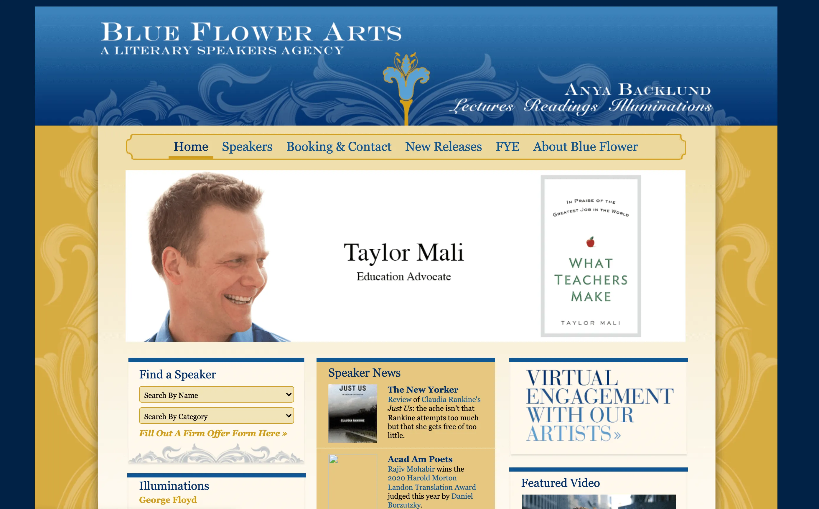
BFA's website was designed by Wooly Mammoth Design, based locally to BFA in Minneapolis.